Semo Nemo
Semo Nemo
concept• typeface design • personal project
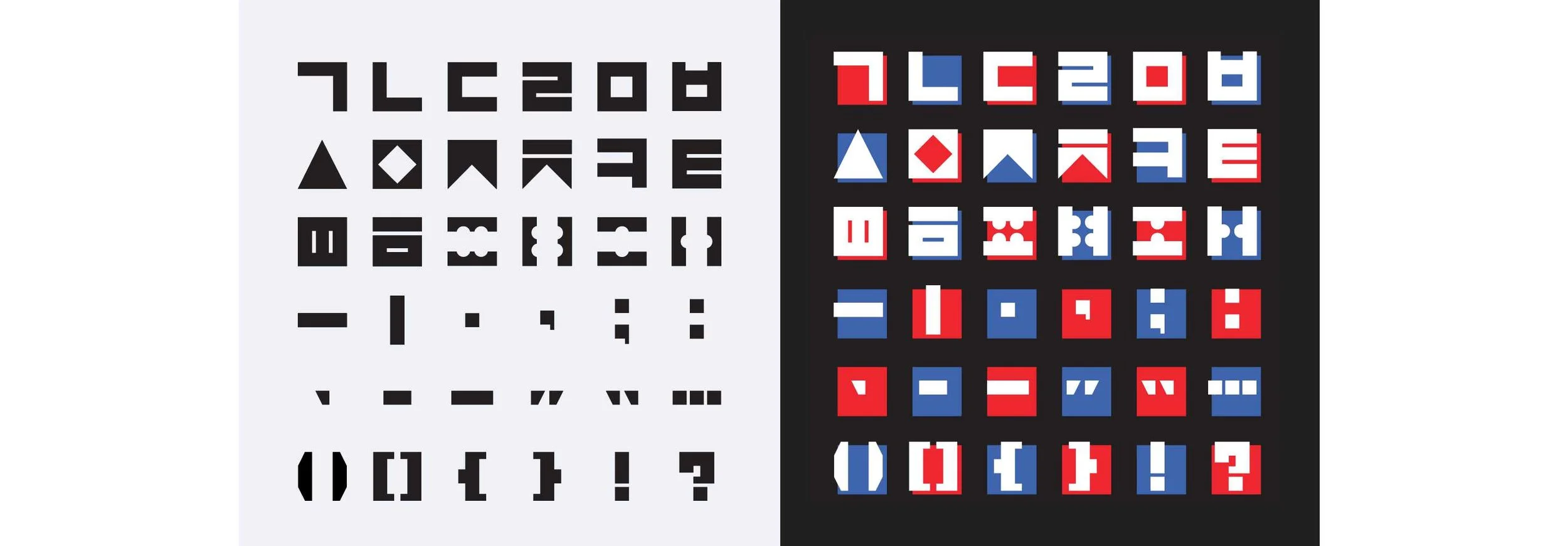
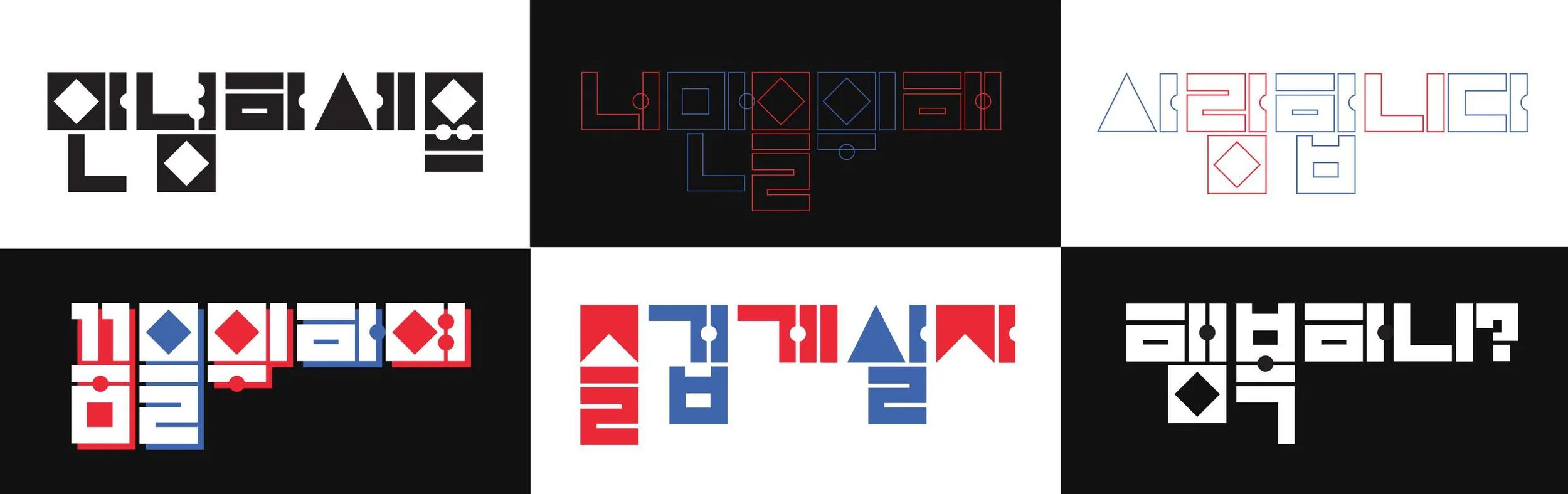
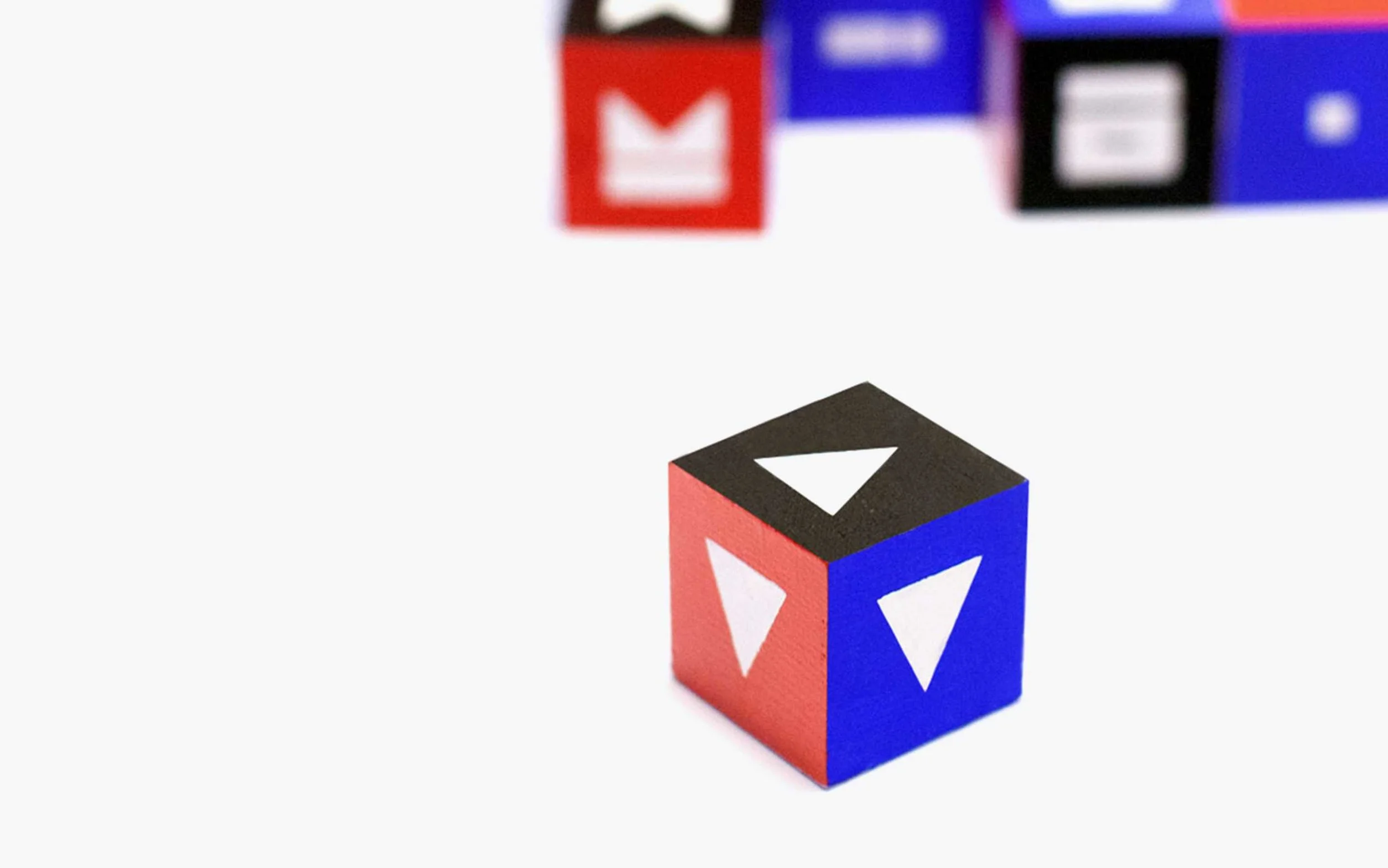
Semo Nemo, which means 'Triangles and Squares' in the Korean language, is a Korean typeface designed based on simple geometric shapes for display and decorative purposes. The irregularity of the height of each letter allows this typeface to be more playful and exciting.
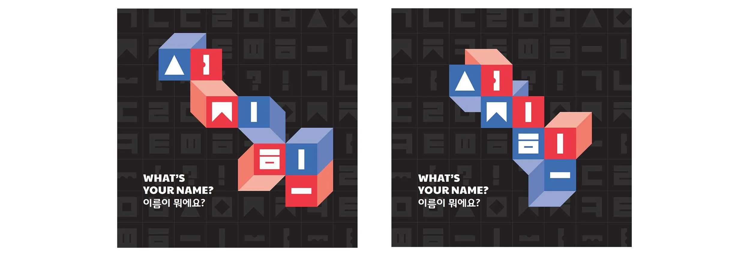
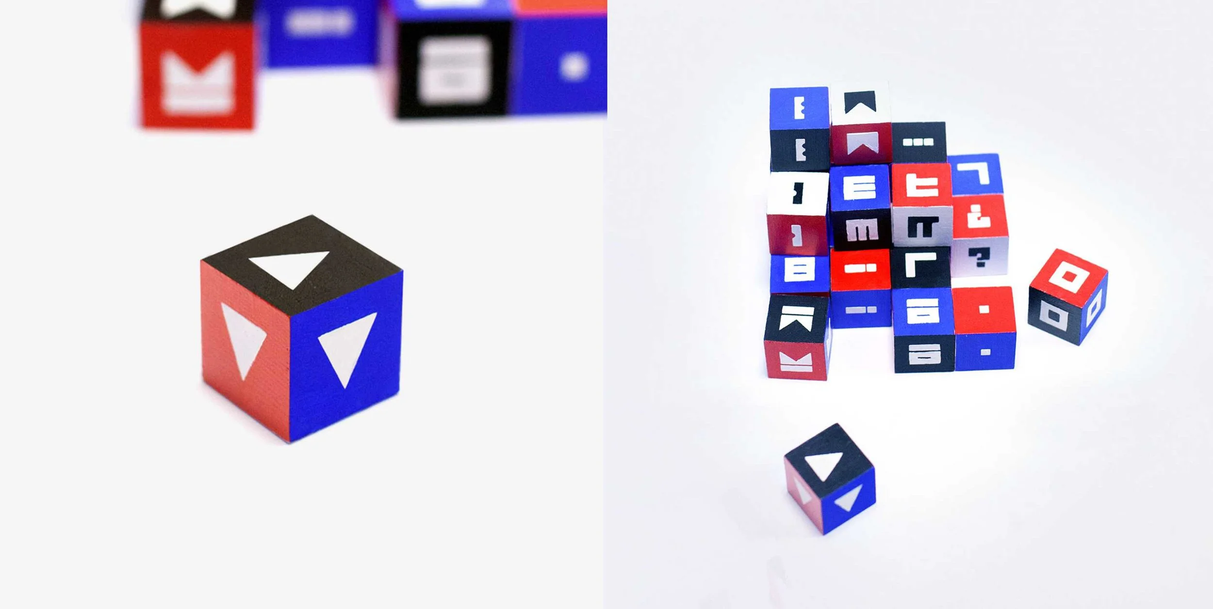
Semo Nemo was designed and created as a side project in hopes to spread the simple, yet beautiful Korean language. Semo Nemo was featured in an exhibit, "What is Your Name" hosted by K/REATE for Korean Alphabet Day Exhibition 2014
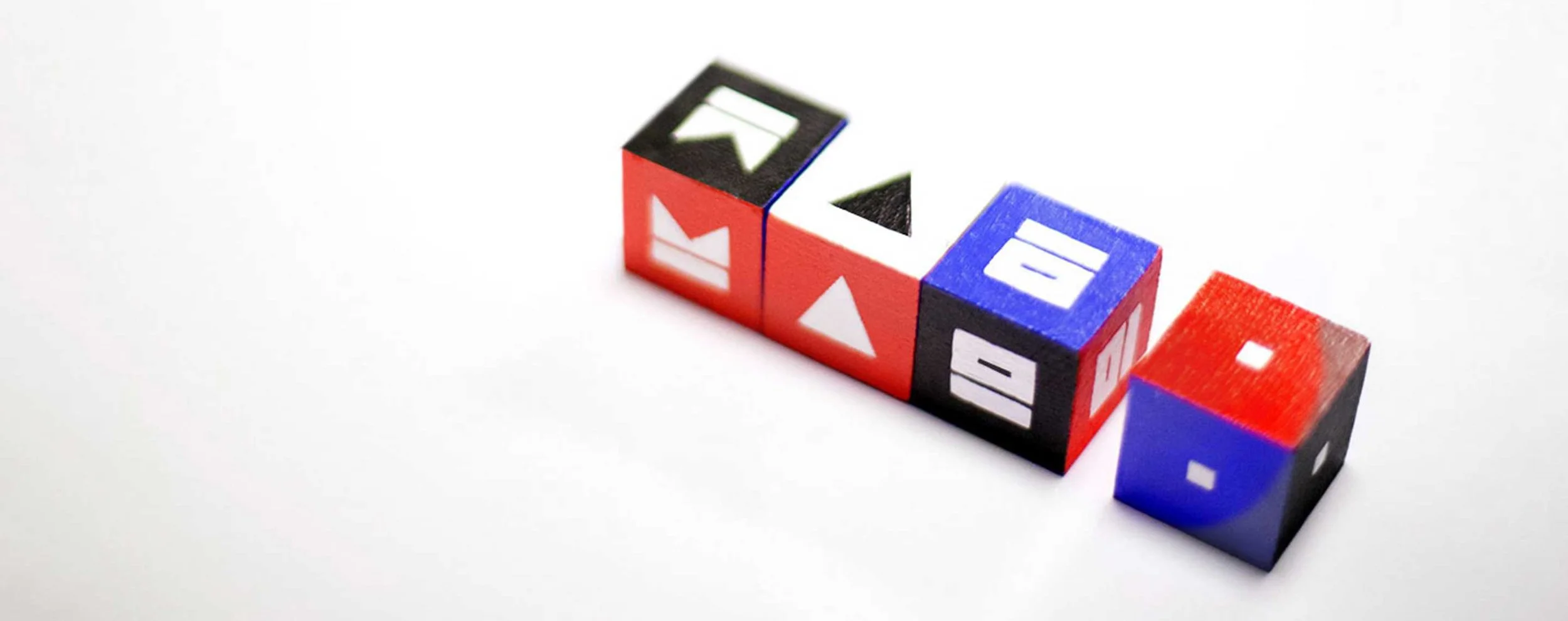
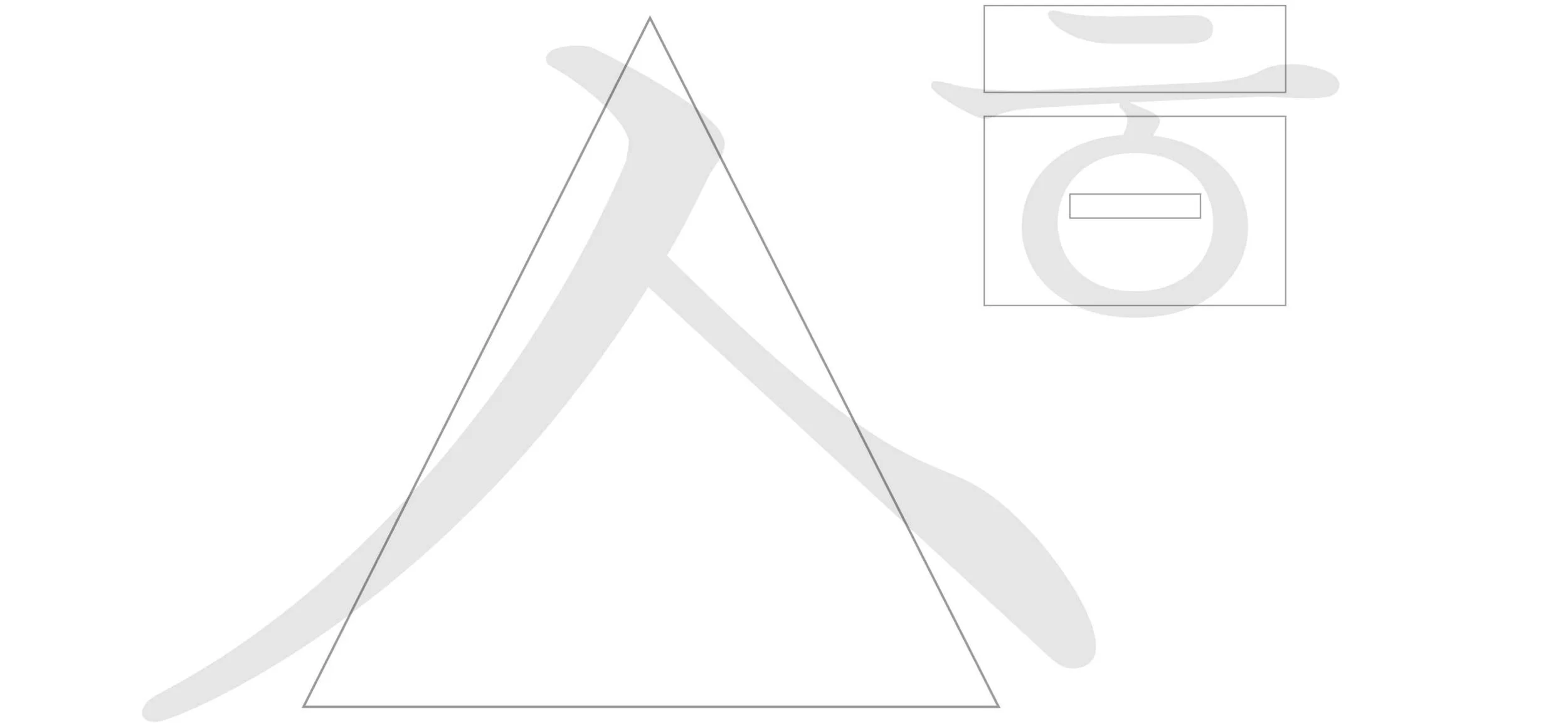
Semo Nemo is designed based on the traditional Korean letters. Each letter is exaggerated, reinvented, and highlighted by simplifying the tradition Korean letters into bold shapes.